The Business Performance Dashboard of Xero is a powerful feature in the Xero accounting software. It is a general hub for real-time business information of your firm. The dashboard allows Malaysian SMEs to have their key information in one place.
Understanding: Xero business performance dashboard
Xero tool business operations dashboard presents massive volumes of information from across the firm. It translates figures into charts, graphs, and simple indicators. These presentations provide easy identification of trends and arrangements at a glance. Users are able to look at data side by side over time periods and spot anomalies.
The dashboard provides real-time information for all types of execution metrics. Managers and firm owners make informed decisions. Instead of reacting to trouble, they can operate beforehand. For example, a sudden drop in sales or cash flow is immediately apparent. This enables quick action to address trouble.
The dashboard also supports collaboration. Different departments are able to view the same data. This makes everyone aligned with firm goals. It’s easier to analyze different scenarios and plan for the beyond. Managers can track goal progress and change strategies when needed.
For Malaysian SMEs, the Business Performance Dashboard of Xero is a good idea. It streamlines procedures, brings finances together, and fuels growth. It makes complex data easier to understand. This helps firm management become more effective and less stressful.
What are the 5 stages of visualization?
Visualization is among the most important factors of business intelligence. Visualization allows companies to transform large amounts of data into valuable information. To perform it correctly, one should be familiar with the five major stages of visualization.
1. Data Gathering and Preparation
The first process involves collecting information from various sources such as sales, spending, or customer opinions. It is an activity that requires cleaning and organizing of data for accuracy. Precise preparation helps in representing values in a straightforward way and makes the visualization more informative.
2. Identifying Variables and Metrics
Next, you select the key variables and metrics that describe your context. For example, you might choose revenue, gross profit margin or net profit margin. Having this knowledge of the drivers, you can say what drives your company property and decide.
3. Knowing Type of Visualization
Different data need different visualizations. Bar graphs are used for comparison of categories, while line graphs convey trends over time. Pie charts work for dividing proportions, and scatter plots illustrate how variables relate. The proposed form of visualization needs to match the task to convey values effectively.
4. Designing for Clarity and Impact
Step four is designing clear and effective visuals. Use legible labels, appropriate color, and simple composition. Avoid clutter and attempt to highlight the most important information. Good design helps to clarify arrangements, anomalies, and insights briefly, enabling companies to accomplish their goals more efficiently.
5. Actioning and Analyzing Insights
The final step is interpreting visualizations. Look for patterns, surprises, or seasonality that will inform your decision-making process. The information collected through visualizations enables you to act knowingly and reach your goals more effectively. Use the insights to set new goals, create adjustments, and follow up on new opportunities.
Process of Setting Up Your Business Performance Dashboard in Xero
Step 1 – Collecting Data and Knowing Your Metrics
Start by gathering data from the different parts of your firm. Such examples are sales amounts, costs, inventories, and consumer feedback. For instance, a retail shop can record sales by each product category every month.
Second, define which metrics are most appropriate. For example, an online company will have customer acquisition costs or repeat purchases as the priority. Understanding these metrics supports choosing the right KPIs.
Utilize Xero’s tools to accurately record your data. Either import data from sales channels or manually record expenses. The process provides you with a precise view of where you stand today. Using this information, you can establish realistic targets and make wise choices.
Step 2 – Creating Visualizations and Charts
Once you’ve gathered your data, transform it into graphical representations. Use line graphs in order to display trends in revenue over a span of time. Use bar graphs to compare sales across regions. Pie charts are suitable to display how expenses are distributed.
For instance, a company can plot sales growth over the past twelve months on a line graph. This can reveal seasonal highs. A pie graph indicating marketing expenses are substantial is another example.
Visualizations make data easier to interpret. They show trends and most important outcomes in a snap.
Step 3 – Setting Budgets (Goals) and Tracking Results
Once you have looked at your data, set goals. That is, you would like to increase sales by 10% in the next quarter. Track progress with your dashboard regularly.
If sales are not performing, review the data. For example, you might find certain products are not doing well. This allows you to take action. You can increase marketing or try out prices.
Tracking your KPIs every now and then makes you realize if your strategies are working or not. If a new campaign is driving sales or not, you can scale up or alter your strategy. This ongoing process keeps your team on track and in alignment.
Step 4 – Utilizing and Executing the Dashboard
Finally, but not least, share the dashboard with your team. Make sure they know how to interpret information. For example, sales managers can review targets and achievements each week.
Make sure your team reviews the dashboard regularly. This keeps everyone informed about procedures. In meetings, look at patterns and trends. For example, you might notice that sales reduce during a particular season. You can schedule special offers during that period.
Regular use of the dashboard improves your organization. Fact-based decision-making becomes simpler. This method makes it simple for you to improve and plan better in the long run.
Check on the blog-> Xero Cloud Accounting: Top 9 Advanced Tips & Tricks
3 Examples of Business Performance Dashboard and Insights in Xero
Xero’s built-in dashboards provide powerful tools for KPI tracking, real-time performance monitoring, and smart business decision-making. Here are three practical examples that showcase how Malaysian SMEs can use these dashboards effectively.
Example 1 – Comparing Budget vs Actual in Xero Dashboard
Tracking your budget performance is crucial to avoid overspending and identify underperformance.
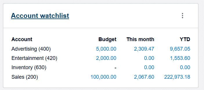
You can configure specific Chart of Accounts in Xero and create budgets for each account using the Budget Manager feature. Once set up, the performance dashboard will display a visual comparison of budgeted vs actual amounts for easy analysis.
This feature helps business owners monitor whether expenses are exceeding the plan or if revenue is falling short. It is critical for keeping your finances in check.
Use Case: A digital marketing agency in Malaysia sets a monthly advertising budget of RM 5,000. By comparing actual ad spend versus budget, they can quickly identify overspending or areas to reallocate funds.
Example 2 – Cash In vs Cash Out in Xero Dashboard
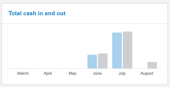
Cash flow is the lifeblood of any business. Once your bank reconciliation is up to date, Xero automatically generates a visual cash in vs cash out bar chart in your performance dashboard.
- Blue bar = Cash In (money received)
- Grey bar = Cash Out (money paid)
- Time frame: Last 6 months
This visualization helps you understand whether your business is consistently generating more cash than it’s spending.
How to Interpret:
- If the blue bars are consistently higher than the grey ones, your business is cash flow positive—a healthy sign.
- If the grey bars are higher, your cash reserves may be declining or tight, indicating a need to improve collections or reduce costs.
Use Case: An F&B outlet notices their grey bars exceed the blue ones over three consecutive months—prompting them to renegotiate supplier terms and speed up customer payments.
Example 3 – Business Snapshot Feature in Xero (Free feature, upgrade to Analytic Plus for more customization in metrics, date range etc)
One of the most insightful tools in Xero is the Business Snapshot, found under:
Business → Business Snapshot
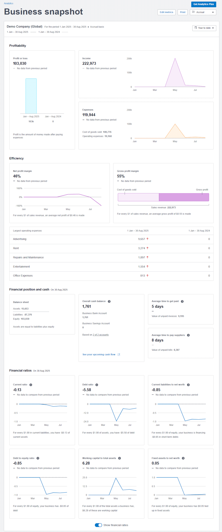
This dashboard provides a comprehensive overview of your business’s financial health through performance metrics and charts, including:
- Profitability: Track net and gross profit margins.
- Income & Expense Trends: See where money is coming from and where it’s going.
- Top 5 Operating Expenses: Quickly identify high-cost areas.
- Financial Position: View assets, liabilities, and net worth.
- Financial ratios (Current Ratio, Debt Ratio, Current Liabilities over Net Worth, Debt to Equity Ratio, Working Capital to Total Assets, Fixed Assets to Net Worth)
Upgrade Tip: Xero’s Analytics Plus (optional add-on) gives you deeper insights:
- Custom date ranges
- Enhanced forecasting
- More flexible metric configuration
Use Case: A consulting firm reviews their Business Snapshot monthly to monitor expense trends and maintain a healthy gross profit margin above 40%.
These built-in features make KPI tracking and performance monitoring accessible to even the smallest businesses. With no complex setup required, Xero’s performance dashboards can help Malaysian SMEs make smarter, faster, and more informed business decisions.
External Resources and Further Reading
Check on the blog-> 13 Easy Steps-Start a Retail Business in Malaysia with Xero
For companies that want a customized solution, Caltrix Asia is ideal. Caltrix Asia expertise in having Xero customized to suit various company needs. They scrutinize your needs thoroughly. They then create an industry-specific, size-specific, and growth-aspiration-specific Xero setup for you.
Their expertise results in your Xero dashboard being perfectly suited for your own company. Decision-making via data is straightforward and efficient. Using Caltrix Asia’s services to implement Xero can help you develop a solution that grows with your business, a free clarification is available now, book from Caltrix Asia’s website now!
Conclusion
A well-structured company accomplishment dashboard of Xero is the key for Malaysian SMEs. It helps them to expand, refine processes, and even foresee future trends. By organizing data, setting clear goals, and graphical displays of key measures, firms can improve rendering. These tools enable better decision-making and firm improvement. Start applying these techniques today. They help you to make good use of your sources. You remain ahead in your industry with an efficient dashboard.
About Xero
Xero is a global small business platform with 4.4 million subscribers. Xero’s smart tools help small businesses and their advisors to control core accounting functions like tax and bank reconciliation, and complete other important small business tasks like payroll and payments. Xero’s extensive ecosystem of connected apps and connections to banks and other financial institutions provide a range of solutions from within Xero’s open platform to help small businesses run their business and control their finances more efficiently.


